PROJECT BACKGROUND
AAA Northeast wanted to upgrade their website aesthetic, improve usability and surface personalized AAA products & services. A usability study and competitive analysis engagement kicked off this website redesign. I led the design efforts and worked with other supporting designer, a PM and a team of developers. The website needed to be responsive and built using a set of reusable components in the content management system Adobe Experience Manager (AEM). In doing so the huge AAA organization could create pages and fill in content without relying on an outside contractor or developer. View the entire desktop invision project here.
SKILLS
UI / UX
User Testing & Analysis
Illustration
Branding Standards
Project Challenges
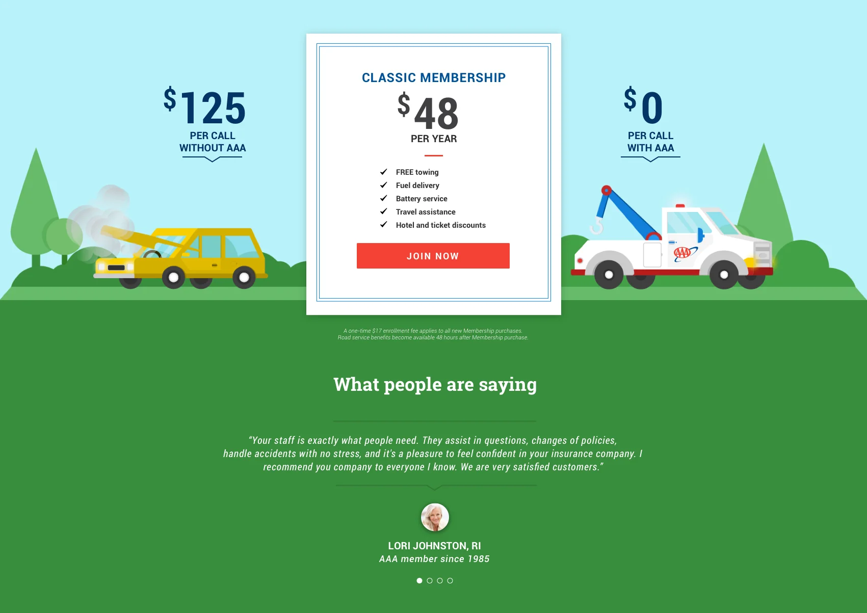
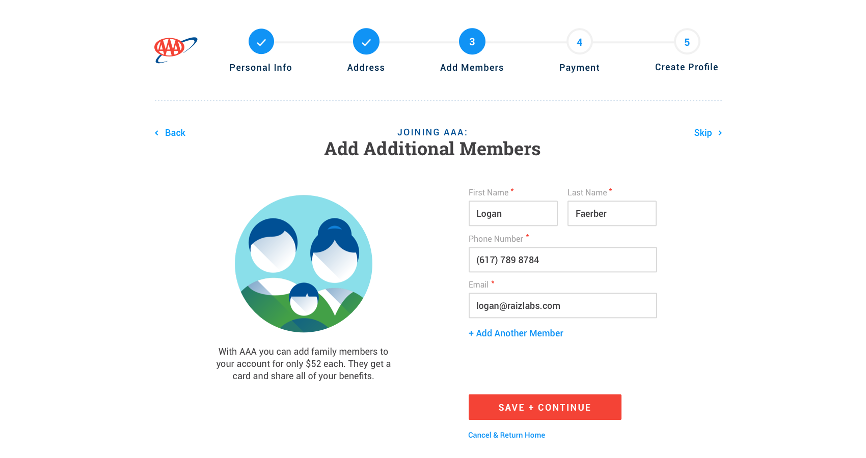
- EASILY SIGN UP TO BE A AAA MEMBER: I redesigned the UX to be more engaging, cater to the different user scenarios, and be overall more user friendly with helper text and friendly illustrations.
- CREATE DESIGN STANDARDS AND REUSABLE COMPONENTS: I created a set of design standards that are modern and inline with the AAA brand in the form of a set of reusable drag and drop components built in AEM.
- INCREASE USER ENGAGEMENT BY SURFACING RELEVANT PRODUCTS AND SERVICES: I designed the top level landing pages to better organize content and allow for users to find what most interests them. In addition, I created templates for secondary landing pages, a variety of content pages, and modals, all of which are responsive.
Starting Point
Below are screenshots of the original website. The site aesthetic is outdated and there is not a ton of visual hierarchy or white space, making it difficult to sift through the content heavy pages.


Research & User Testing
The phase 1 team put together an analysis of a leading competitor for each of the AAA business verticals. Below you can see that for discounts, insurance, membership and travel.

Onboarding
DEFINING USERS AND BUSINESS GOALS
- User w/o membership or account
Goal: Join AAA
- Member w/o account
Goal: Create Account
- Account holder with membership
Goal: Sign in
- Signed in account w/ membership
Goal: Drive engagement w/ relevant content
- Account holder w/expired membership
Goal: Renew membership

BECOME A MEMBER WIREFRAMES

SIGN IN COMPS
BECOME MEMBER COMPS


Design Standards
I expanded the traditional blue and red color scheme of AAA with more shades, using blue as the primary brand and UI color. The client loved Material Design and wanted to anchor their branding on those standards so I used variations of Roboto as the website typeface.
REUSABLE RESPONSIVE COMPONENTS
As a team, we identified a set of necessary components and how they could be reused with different personalized content through out the website.

Landing Pages and Templates
TOP LEVEL LANDING PAGES
After the user has signed in, each landing page template would have personlized content swapped out when applicable based on the member data.

MEMBERSHIP LANDING PAGE
TRAVEL
I designed the travel widget and all of the potential search permutations.

DISCOUNTS

SUBCONTENT PAGES


Increases in user engagement and new users led to a 33%+ increase in revenue generated by the website.
Metrics showed us that these users were also purchasing a higher number of products and services, leading to both increased revenue and customer loyalty. Ultimately, users are able to find what they are looking for faster and the AAA brand was able to reconnect with their audience.
After 17 months of research, design, and development, the website launched in March 2017. The redesigned site showed metrics that demonstrated higher user engagement. People were spending more time on each page, and less time searching the site.
" ..In just a short period of time we’ve gone from being available to our members online to becoming competitive to many of the largest brands with real-time tools that will enhance the member experience for many years to come."
- MARK E. PELLETIER Managing Director, eBusiness , AAA Northeast