
PROJECT BACKGROUND
When we first met with the client, they had an Android app wireframed out based on their beta iOS app. The idea of the app is extremely robust allowing a member to take advantage of AAA services including: discounts on shopping, travel, insurance, Roadside Assistance and more. This was a great place to start, however there were some key UX holes, the navigation and app structure was clearly iOS native and the UI style did not conform to the newly released Google Material Design standards. As the lead designer working with a PM, it was my job to create and test prototypes that led to high fidelity mock up deliverables.
Check out the prototype here.
SKILLS
UI / UX
Prototyping
User Testing & Analysis
Illustration
Project Challenges
- SURFACE RELEVANT AAA SERVICES: In order to do this we created a card system on the home screen that harnesses user data to create a more tailored and timely experience.
- IMPLEMENT MATERIAL DESIGN STANDARDS: Implementing basic interaction paradigms, core navigation and visual aesthetic, I made the app feel more Android native and on the cutting edge of Google Material Design.
- UX TWEAKS: We redesigned the onboarding, becoming a member, and making and managing payments experiences to be seamless for the user and visually appealing.
Starting Point
Below are the client generated screens attempting to use native iOS controls for an Android app. There are UI inconsistencies (i.e. different styles of forms) and two navigation patterns being used, neither of which utilize the menu bar to its fullest potential.
Home Screen & Card UI
To understand what the card UIs needed to achieve, we made a list of all types of information and actions that would be surfaced.
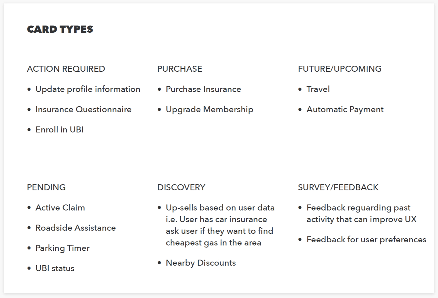
CARD SKETCHES

Final Card System

Home Screen Final Design
WHAT'S NEW
- Home screen navigation now displays hamburger menu and RSA icon. All other content is included within the hamburger menu
- Personal image displayed in the header that links to user profile
- Profile image added to the Home screen. Tapping image links to My Profile modal
- Updated card styles following material design guidelines
- Cards update based on geo-location, pending bills, trips, etc.

UX Tweaks & Onboarding
mEMBER SIGN IN
Onboarding had to be designed for several user scenarios: members with an account, members w/o accounts and non-members. Below you can see screens for existing AAA members without an app account. I also create custom illustrations to showcase the app's value proposition.
BECOME A MEMBER
If a user is not a AAA member, we created a flow that allows them to compare different membership levels, input their personal details, add family members, and make a payment to officially join AAA on the spot.
mAKE A PAYMENT FROM HOME FEED
If a user has a a bill coming up, we will populate a card to the top of their home feed and send a notification. With just a few taps, they can pay their entire bill or a portion of it within the app. Once the user has made a payment the card will disappear.